creative projects
In my opinion, these projects represent my thought-process and design style the best—transformative, beyond the assignment, and conceptually fun.
One aspect of a project or deliverable I often consider is waste—if this were produced and distributed, where would it be in 1 week? 1 month? 1 year? I like to attach function to paper to extend it’s lifespan.


inked up
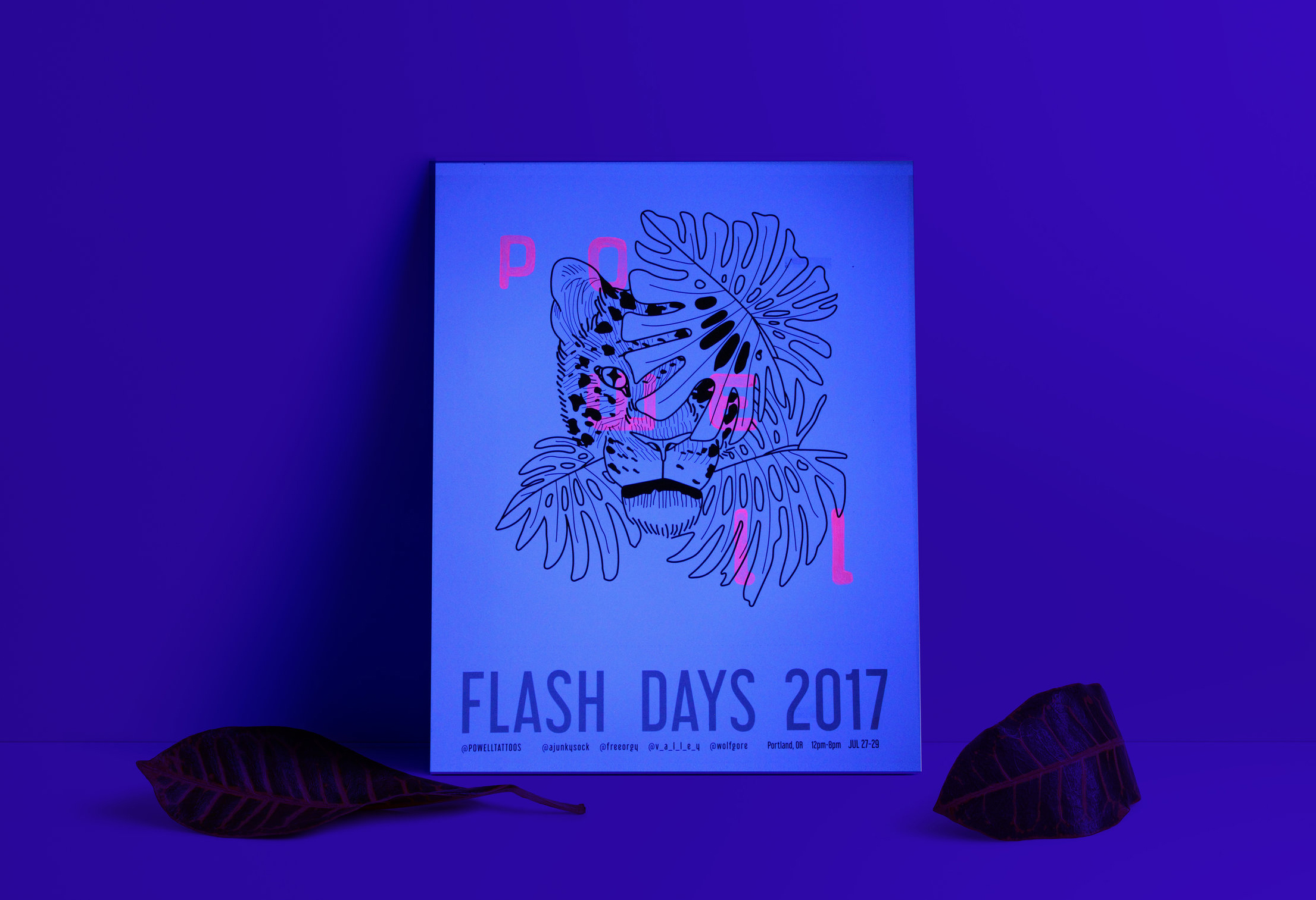
Inspired by UV ink tattoos, hang this under a black light to reveal the tattoo shop name.
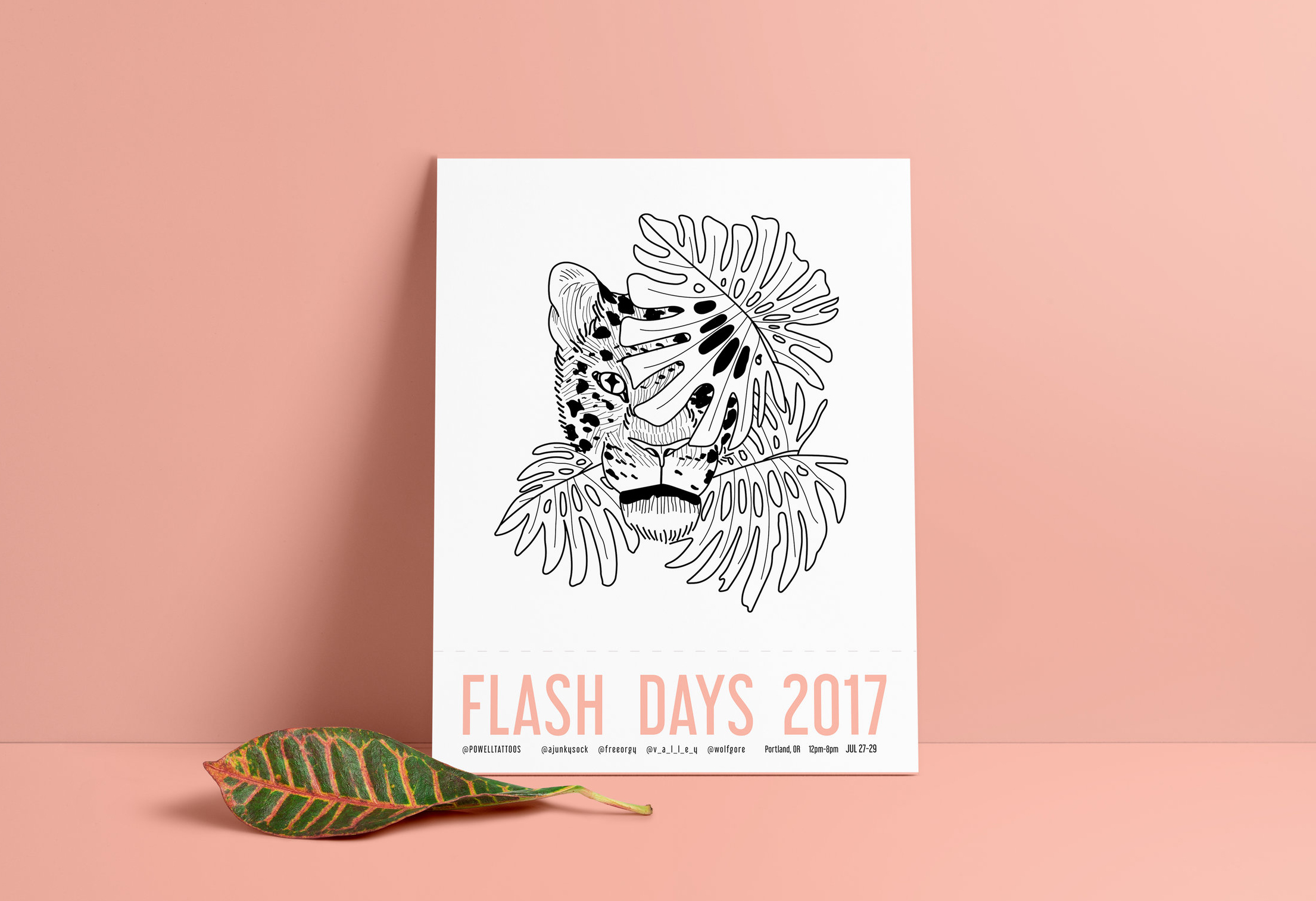
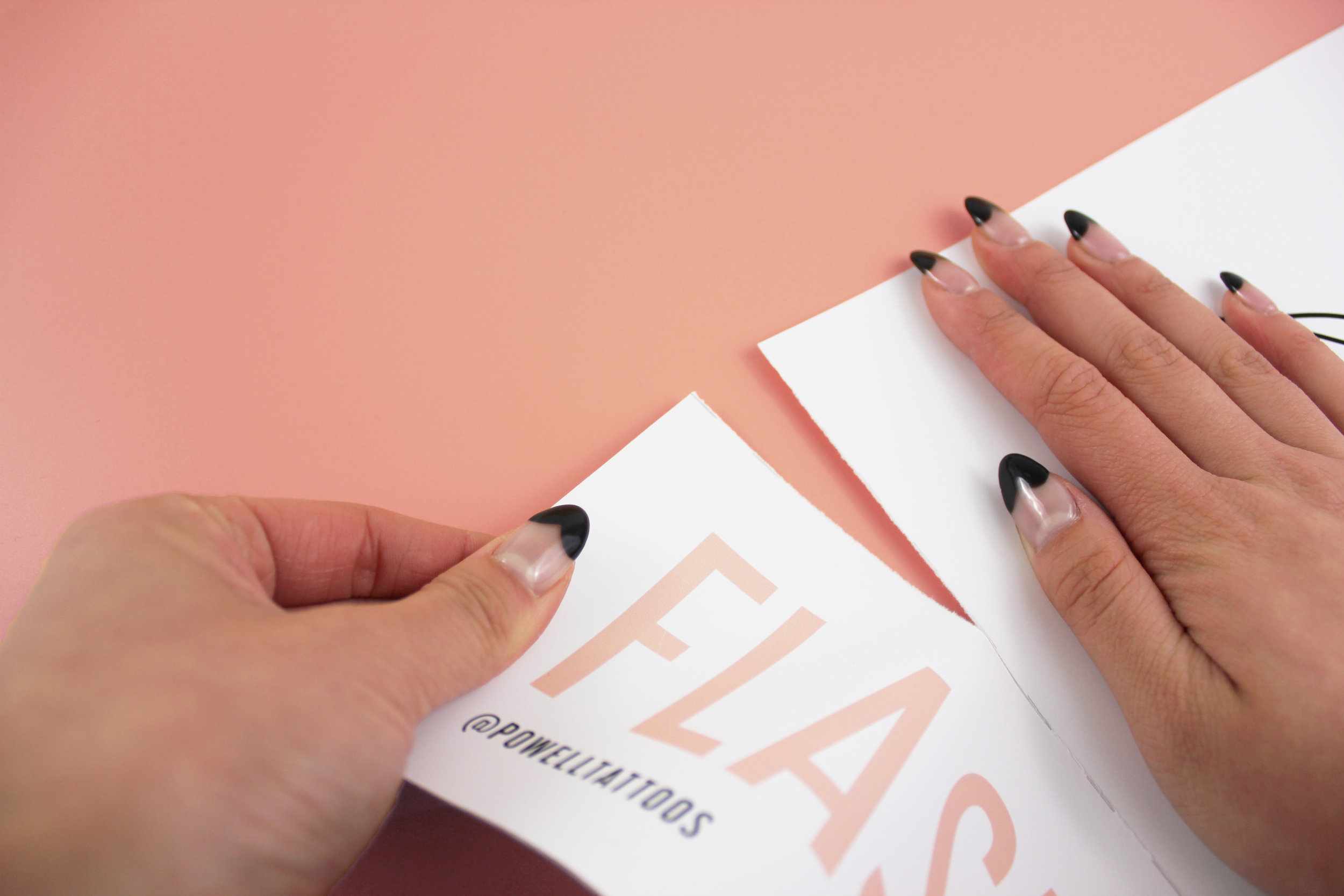
Intended to advertise a tattoo shop’s event, this poster would have been out of date and futile after the event had passed. To avoid the recycling bin, this poster is perforated so that all outdated event information can be removed and the poster can exist indefinitely.
client specific —
UV ink can be a unique touch to tattoos, and to reiterate that idea to a client, this poster has the shop name printed in UV ink. When hung under a black light, a client can see this poster glow while getting a UV ink tattoo of their own.
*For the purpose of this project, I was unable to access a printer that printed UV ink. Instead I traced the letters by hand with a UV ink marker.
LSNC services: evicted
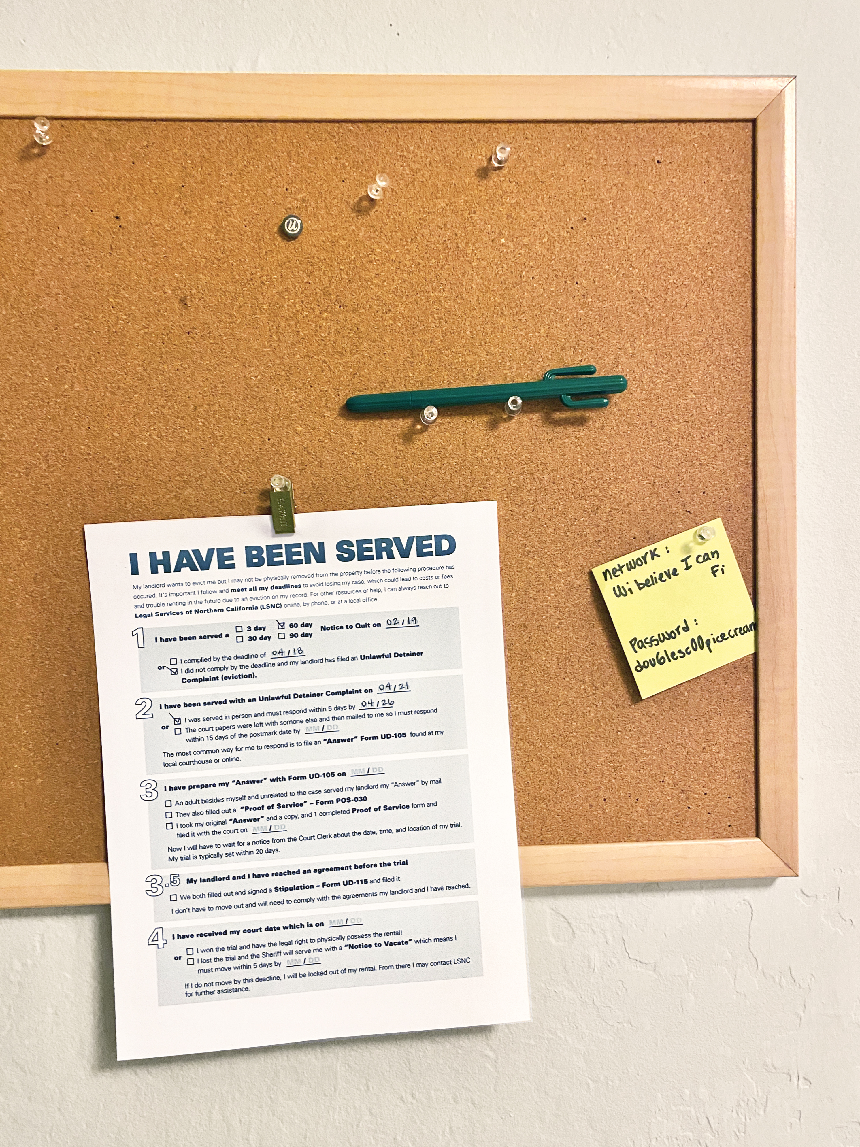
In collaboration with Legal Services of Northern California, a non-profit that serves the underprivileged. We were tasked with re-designing an info sheet they provide to clients who have been served an eviction notice.
The original provided is extremely difficult to follow and confusing for a client to follow and keep track of their case when eviction notices can have different timelines. I wanted to design something that was interactive and made it easy to keep track of deadlines and required steps. In the original, instructions listed the number of days between each part of the process which could be difficult to keep track of and lacked an easy flow.
The form I designed became a check list where the client could track their progress and timeline by filling in key dates. The client could keep the form on their kitchen fridge or a bulletin board so it would be top of mind.


a new BAC chart
How might we re-design the Blood Alcohol Content chart for the DMV? The current official BAC chart distributed by the CA DMV can be difficult to interpret. In this alternative presentation of alcohol impairment, I wanted to emphasize the important factors of impairment: weight, number of drinks, and the grey area that exists(because a single chart cannot be definitive of everyone and we absorb alcohol at different rates).
Knowing that I myself would throw away a random PSA sent from the DMV, I wanted this chart to be interactive and actually a product instead. Based on each weight group, I created their own separate chart—wallet sized! Double sided, of course, with instructions on how to read the chart. The recipient could then take their own chart with them out to the bars, and share the other cards with their family and friends of different builds. An overall chart can stored in the car.

